viewof current_sd = Inputs.range(
  [1, 5],
  {value: 1, step: 1, label: "Standard Deviation"}
)

viewof current_mean = Inputs.range(
  [0, 20],
  {value: 0, step: 5, label: "Mean"}
)

// Convert the data frame into an array and filter by the selected parameters.
filtered = transpose(data).filter(d => d.sd_value === current_sd && d.mean_value === current_mean)In the previous post of the Statistics Foundations series, we explored the inherent errors associated with working with samples instead of the entire population. These errors stem from the limitations of samples in capturing the full spectrum of population nuances.
We delved into quantifying this error, commonly known as the standard error, by assessing the variability of a statistic derived from different samples of the same size drawn from the same population. To further explore this concept, we focused on the mean. We used the standard error definition to derive a formula that directly computes the standard error of the mean, dividing the population’s standard deviation by the square root of the sample size. However, we recognized that applying such a formula in practical scenarios can be unfeasible, as it hinges on possessing information about the entire population—information that is typically unavailable, underscoring the very reason why we employ samples in the first place.
Nevertheless, we uncovered a practical workaround by assuming that the standard deviation of our sample serves as an estimator for the population’s standard deviation. This substitution effectively transformed the formula into one that employs the sample’s standard deviation divided by the square root of its size, allowing us to estimate the standard error.
So far, our primary emphasis has been on understanding and quantifying the sampling error. But let’s take it a step further and connect this concept to something more practical and tangible. Imagine if we could use this knowledge to pinpoint a range within which our sample statistics are likely to fall and, by extension, where the true population parameters may lie. That’s where the notion of confidence intervals comes into the spotlight, a topic we’ll explore in this blog, with a primary focus on the mean.
Once more, we’ll be employing the same dataset from our previous posts, encompassing data from 2,000 supermarket customers, including details about their age, annual income, and educational level. As in our prior discussions, we’ll operate under the assumption that this dataset comprehensively captures information about all our customers, effectively representing our entire population.
Distributions
In our previous discussions, we’ve touched upon the concept of distribution without providing a formal definition. In common parlance, this term is commonly used and readily understood, as demonstrated by phrases like “concentrated urban population distribution” or “disparities in wealth distribution within a country.” In these examples, “distribution” simply denotes how individuals or assets are spread across a specific area.
In statistics, the concept of distribution remains conceptually consistent. A variable’s distribution illustrates how the different values of that variable spread out and which are more prevalent. Our exploration of distributions has primarily involved the examination of a variable’s histogram—a visual representation that conveys the frequency of values within predefined intervals, commonly known as “bins”. This approach provides a direct and intuitive means of discerning the spread of values and identifying those that occur more and less frequently. For instance, let’s revisit the annual income distribution of our “population”.
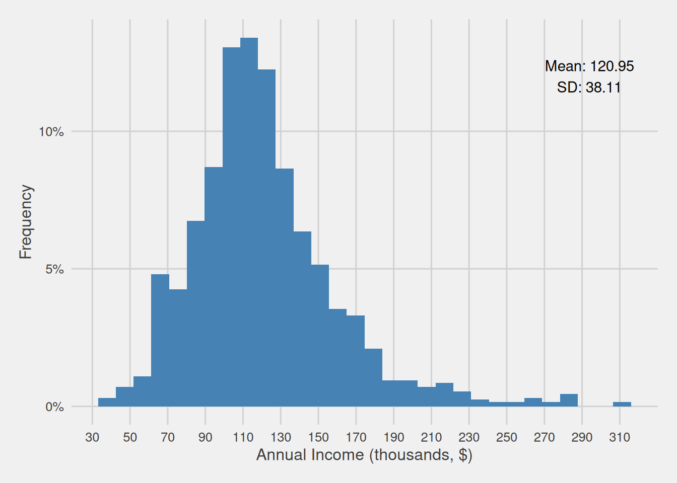
Figure 1 offers a visual representation of our population’s annual income distribution. This graphic, for instance, reveals that a substantial portion of our customers falls within the income range of $80,000 to $150,000, specifically encompassing 1,427 individuals, equivalent to 71.35% of our customer base.
Now, consider a scenario where we randomly select a customer and, before checking any of their information, we make an educated guess about their income. In this situation, it’s reasonable to infer that their income is highly likely to fall within the range of $80,000 to $150,000, as the majority of our customers are concentrated in this income range.
Consequently, distributions provide us with a framework to describe variables using the language of probability. This is why, in statistics, we often refer to them as probability distributions. To illustrate, in the previous example, we could state that the probability of a randomly chosen customer having an income between $80,000 and $150,000 is 71.35%. The connection between a variable’s values and their associated probabilities can be mathematically expressed through a function, which directly relates the variable’s values to their respective probabilities.
Discrete and continuous distributions
When discussing probability distributions, it is crucial to distinguish between two fundamental types: continuous and discrete distributions.
Discrete distributions are characterized by elements that can only assume a finite number of values within a defined range. Examples of such distributions include the number of children in a family or the count of customers in a shop on a given day. These variables take on specific, countable values.
On the other hand, continuous distributions consist of elements that can take any value within a specified interval. While our everyday thinking and calculations often involve finite numbers, consider scenarios where precise measurements are vital, such as in pharmaceutical drug development, where even minuscule differences in weight can have significant implications. In this context, the weight of substances is treated as a continuous variable.
In continuous distributions, owing to their infinite range of potential values, it is not possible to precisely calculate the probability associated with a specific value. Conversely, in the case of discrete distributions, where a finite and countable set of values exists, we can accurately determine the probability associated with each individual value. In practical terms, this means that for continuous variables, we can only compute the probability of a variable falling within a certain range. While for discrete variables, we can calculate the probability of it assuming a specific value or falling within a particular range.
Many probability distributions are frequently encountered and have earned distinctive names due to their importance. One such example is the uniform distribution, where every potential value of a variable is equally likely to occur. Another prominent distribution is the normal distribution, recognizable by its bell-shaped curve.
While there are undeniably several other frequent probability distributions, for the purpose of this discussion, we will concentrate on the normal distribution. This emphasis is justified by its pivotal role in facilitating the translation of sample mean and sampling error, quantified by the standard error, into intervals within which we can confidently predict the likely range of the population mean. These intervals are commonly known as confidence intervals.
The normal distribution
The normal distribution, also known as the Gaussian distribution, is one of the most valuable continuous distributions, primarily because many statistics are normally distributed in their sampling distribution (as we saw in the previous post for the case of the mean).
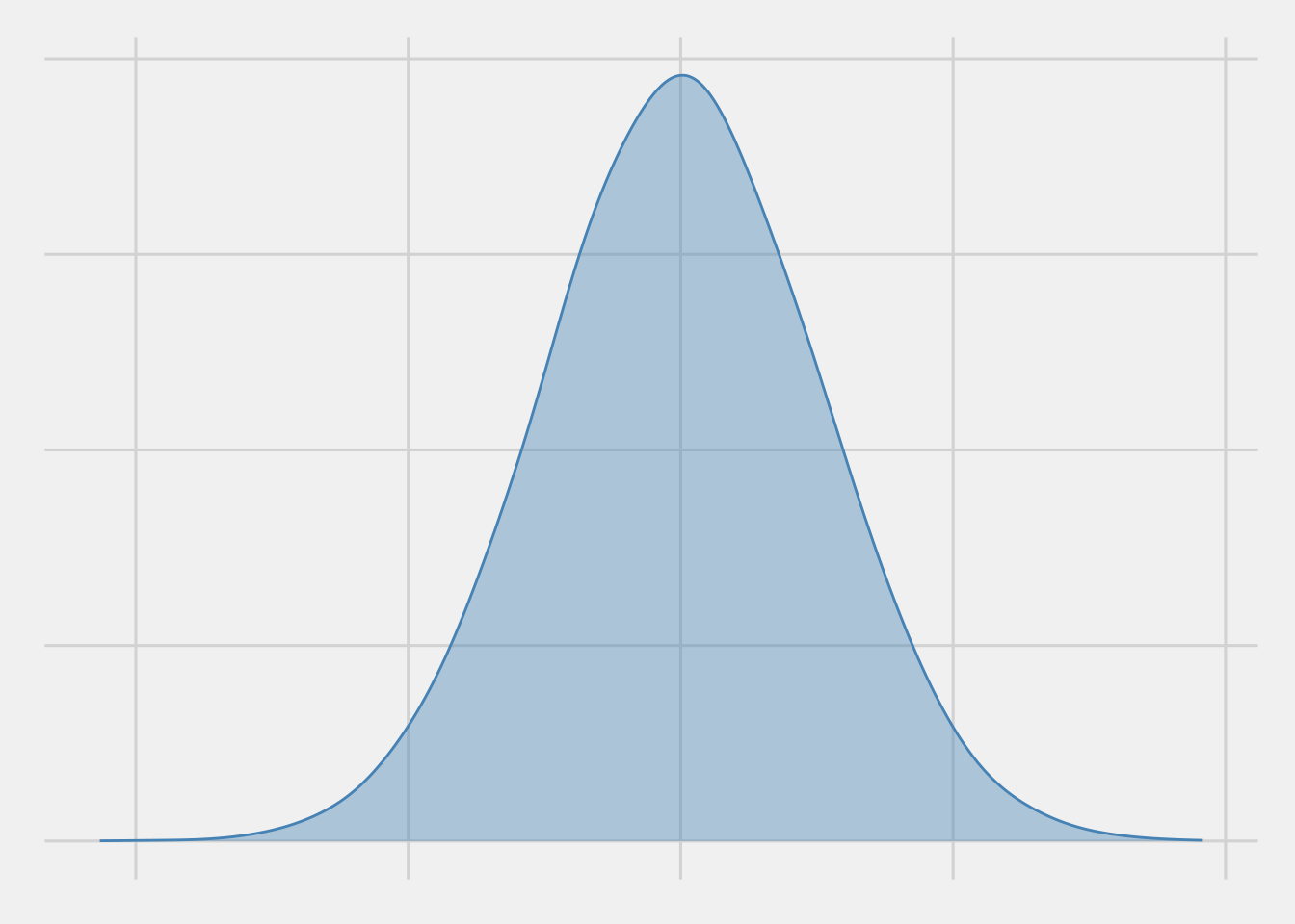
The normal distribution is easily recognizable by its classic bell-shaped curve, as depicted in Figure 2. This curve resembles a perfectly symmetrical hill with a clear peak at its center, which represents the distribution’s mean. As you move away from this peak, the curve gradually slopes downward and then gently turns outward. This smooth descent and outward turn reveal a pattern of how data spreads—the likelihood of observing values becomes lower as you move further away from the mean, making values closer to the mean more probable.
Additionally, the symmetry of the normal distribution means that the probabilities of finding values above and below the mean are identical. In simpler terms, it implies that the chances of observing values on one side of the peak are the same as on the other side.
Mean and standard deviation: shaping the normal distribution
The entire shape of a normal distribution can be effectively described using just two key parameters: the mean and the standard deviation.
Notation
Given that the mean and the standard deviation effectively describe the entire shape of a normal distribution. As such, we typically employ the following notation to succinctly represent a normal distribution: \(N(\mu, \sigma^2)\), where \(\mu\) is the variable’s mean and \(\sigma\) is the variable’s standard de
Therefore, we can denote that a random variable \(X\) is normally distributed with mean \(\mu\) and standard deviation \(\sigma\) as:
\(X \sim N(\mu, \sigma^2)\)
The mean, as mentioned earlier, represents the distribution’s center and the location of its peak. On the other hand, the standard deviation characterizes the curve’s shape. It indicates whether the curve is relatively flat or sharply peaked.
Figure 3 offers an interactive visual representation showcasing how tweaking the mean and the standard deviation influences a normal distribution. When we adjust the mean, while keeping the standard deviation constant, we how the entire distribution shifts. An increase in the mean nudges it to the right, while a decrease causes it to veer to the left. Conversely, changing the standard deviation while maintaining the mean constant is like stretching or compressing the data. A smaller standard deviation suggests that most data points group closer to the mean, yielding a tall, slender curve. On the contrary, a larger standard deviation indicates that data points are more dispersed, resulting in a shorter, broader curve.
The normal probability density function
As we’ve just observed and articulated, the core characteristics of a normal distribution revolve around its mean and standard deviation. Mathematically, the shape of a normal distribution can be portrayed through a functional relationship between the values of a normally distributed variable \(X\), characterized by a mean of \(\mu\) and a standard deviation of \(\sigma\), and their probability density, known as the probability density function:
\[ f_X(x) = \frac{1}{\sigma\sqrt{2\pi}} e^{ -\frac{1}{2}\left(\frac{x-\mu}{\sigma}\right)^{2}} \]
The pivotal element within this formula is the exponential term \(\left({ -\frac{1}{2}\left(\frac{x-\mu}{\sigma}\right)^{2}}\right)\). This term effectively communicates the rate at which the probability density diminishes as we distance ourselves from the mean (\(\mu\))—as \(x\) moves farther from \(\mu\), the lower the probability density. It’s essential to note that a larger standard deviation (\(\sigma\)) results in a reduction of the magnitude of this expression, which, in turn, moderates the pace of the probability density decay.
Probability densities
It is essential to differentiate between probability densities and probabilities, as these two concepts fundamentally diverge. As we have underscored previously, computing the exact probability of a continuous variable taking a specific value is unfeasible, given that continuous variables can theoretically encompass an infinite range of values.
To illustrate this, consider measuring an individual’s height, which may be reported as 175cm. However, if we possessed an incredibly precise measuring instrument, it might record the height as 174.9999945 cm. In practice, we typically round such measurements to a more practical form, like 175 cm, instead of expressing them as infinite decimals.
When we talk about probability densities, we essentially employ a similar principle — grouping values near one another. This grouping enables us to represent the likelihood of a value falling near a specific point, such as 175cm, without claiming it is precisely 175cm. It’s important to note that probability densities, in isolation, lack a direct interpretation as probabilities. However, they are ingeniously constructed to ensure that the area beneath the density curve always maintains its interpretability as genuine probabilities.
The 68-95-99.7 rule
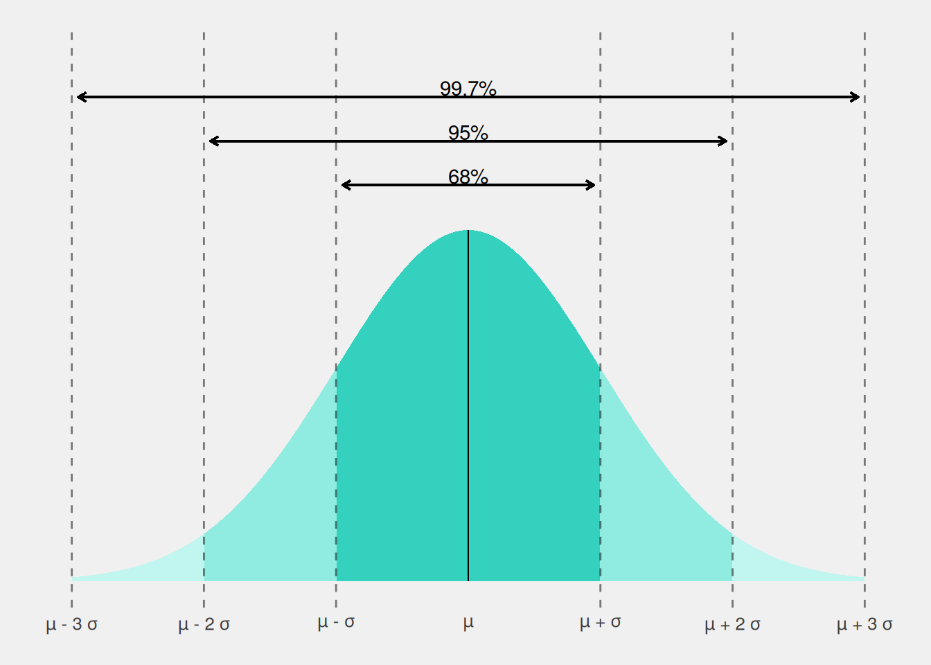
Since the “probability” of specific values in a normal distribution is dictated by the mean and the standard deviation, we can directly associate the likelihood of specific events with these two parameters, particularly concerning how many standard deviations we deviate from the mean. This relationship gives rise to a widely recognized rule, commonly known as the 68-95-99.7 rule. According to this rule, there’s an approximate probability of 68% that a particular observation falls within one standard deviation from the mean (i.e., between \(\mu - \sigma\) and \(\mu + \sigma\)), roughly 95% within two standard deviations from the mean (i.e., between \(\mu - 2\sigma\) and \(\mu + 2\sigma\)), and approximately 99.7% within three standard deviations from the mean (i.e., between \(\mu - 3\sigma\) and \(\mu + 3\sigma\)). In this context, the values 1, 2, and 3, representing the number of standard deviations from the mean, are often referred to as critical values. These values help to define specific regions in the distribution.
In simpler terms, this rule tells us that for a normally distributed variable, roughly 68% of observations are within one standard deviation of the mean, about 95% are within two standard deviations, and approximately 99.7% are within three standard deviations. Figure 4 provides a visual representation of this rule.
Sample means and the normal distribution
Now that we have a better understanding of probability distributions and how they help us assess where most data points are likely to cluster, as well as to assess the probability of an unknown data point falling within a specific range, let’s revisit our example involving supermarket customers. In the previous post, we uncovered an essential concept: sample means drawn from the same population and of the same size conform to a normal distribution with its center—the distribution’s mean—aligning with the population’s mean.
Visualizing the concept
To provide a visual representation of this concept, Figure 5 displays a histogram that provides an overview of the means obtained from 10,000 samples, with each sample containing 40 randomly selected customers from our population. In essence, this histogram visualizes the mean sampling distribution for samples of 40 observations drawn from our population.
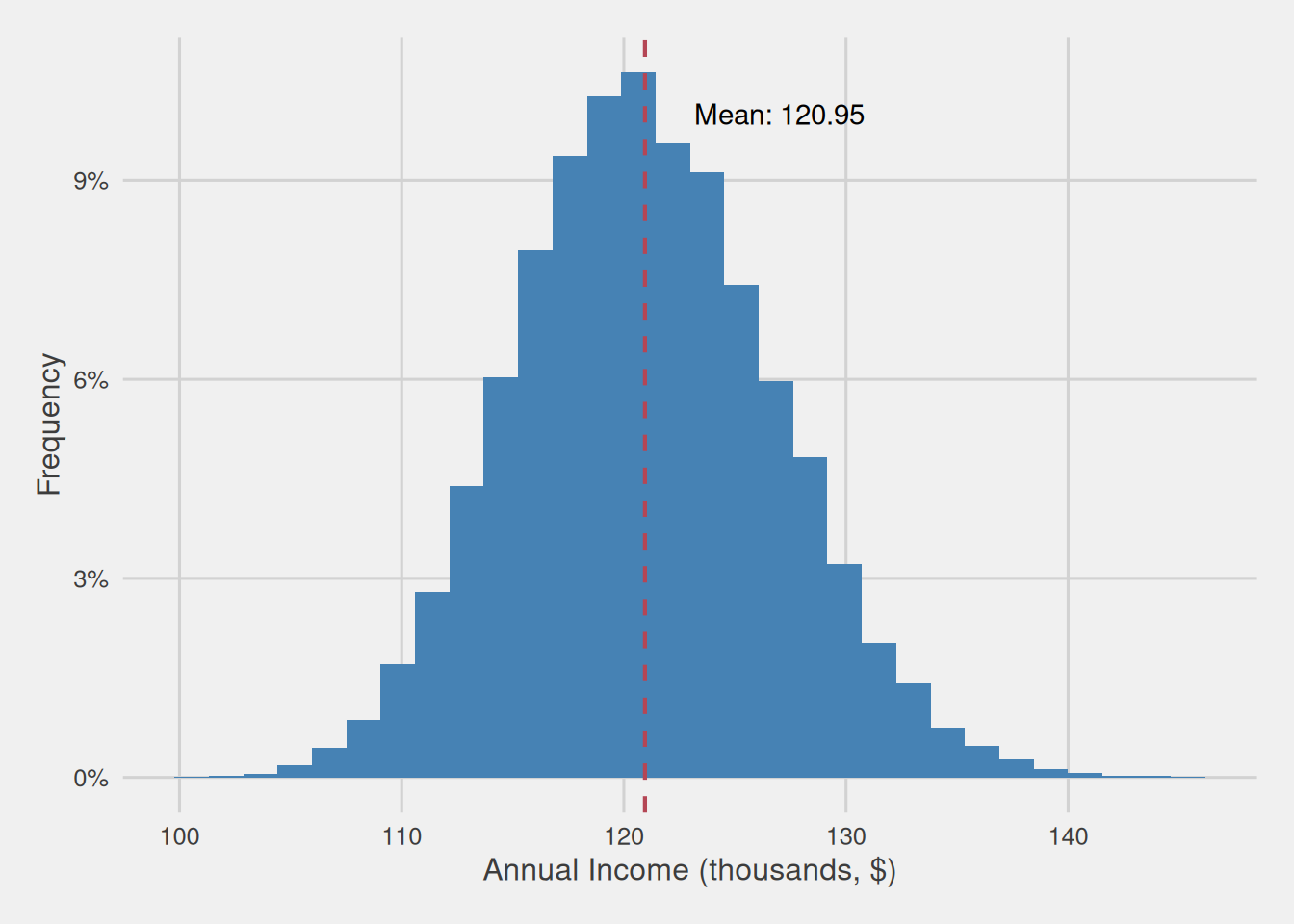
As evident from the figure, these sample means display a characteristic bell-shaped distribution, i.e., following a normal distribution, with the distribution mean precisely aligning with the population mean, which, in this case, is $120,950. Additionally, the standard deviation of this distribution, which is equivalent to the standard error of the mean, is $5,862.
Applying the 68-95-99.7 rule
By applying the principles of the 68-95-99.7 rule, as explained earlier, we can infer that approximately 68% of samples drawn from the population will fall within one standard deviation from the mean, about 95% within two standard deviations, and nearly 99.7% within three. Notably, the standard deviation of sample means, computed from various samples of the same size and from the same population, corresponds to their standard error, whereas the mean aligns with the population mean. Consequently, we can rephrase this as follows: about 68% of sample means will be within one standard error of the population’s mean, approximately 95% within two standard errors, and nearly 99.7% within three standard errors of the population’s mean.
Practical example and intuition
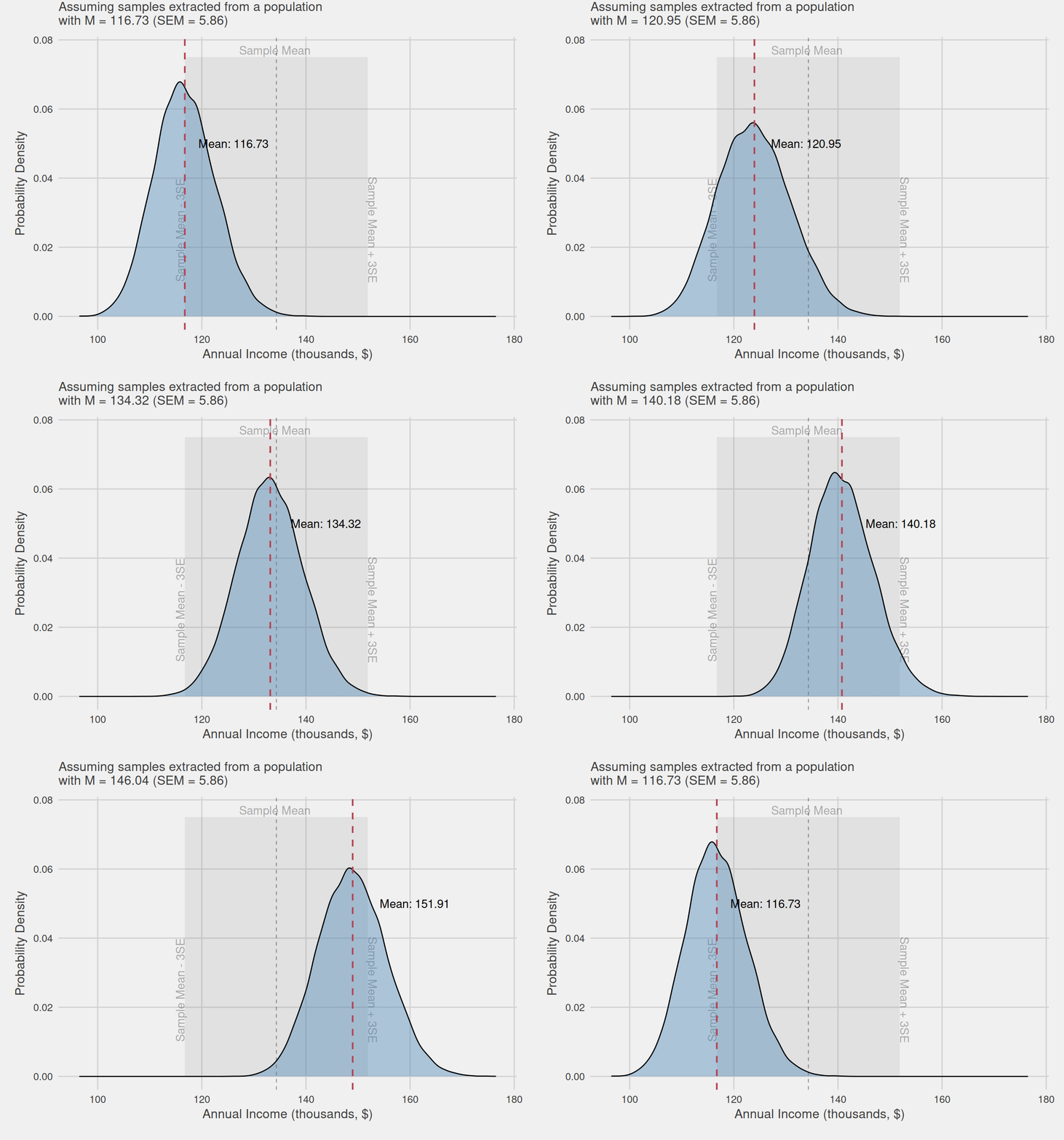
Now, let’s apply this understanding in practice. Consider a scenario where we know the standard error of the mean (SEM = $5,862), but the population mean remains uncertain. However, we want to have an idea of the value the population mean could take. To do so, we select a sample of 40 customers from our population and calculate the mean of their annual income, which turns out to be $134,320.
This process of taking a sample and computing its mean is akin to randomly selecting a value from the distribution we discussed earlier, the mean sampling distribution. Therefore, it is highly likely that the value we obtain from this sample will be found within three standard errors of the population’s mean, as approximately 99.7% of sample means would be found within this range. This potential difference that we could have from the population mean is commonly known as the margin of error.
Consequently, we can reverse the previous statement, affirming that the population mean is very likely to fall within three standard errors of the current sample mean. Therefore, we can say that our population’s annual income mean will be found with a 99.7% confidence within $116,734 (\(134,320-3\times5,862\)) and $151,906 (\(134,320+3\times5,862\)). We talk about 99.7% confidence because there’s a small chance (0.03%) that the population mean could be farther away than 3 standard errors. That’s why we refer to these intervals as confidence intervals, as they give us with some level of confidence, an interval in which the population mean will be found.
Visualizing the intuition behind confidence intervals
Figure 6 visually illustrates the intuition behind our reasoning. We assume that the mean obtained from our sample could belong to any mean sampling distribution, which center, i.e., distribution mean and, in turn, population mean, is found within this ±3SEM area, highlighted with a slightly grayer shade. Even the mean we obtained could be the center of the distribution, i.e., the population mean.
Directly measuring errors
In our previous example, we gained an understanding of confidence intervals by examining the distribution of sample means. However, we can take this a step further by directly translating the distribution of sample means into an error distribution.
Error, in this context, refers to the difference from the population’s mean. To calculate it, we simply subtract the population mean from each individual sample. Non-zero values indicate a disparity between the sample mean and the population mean, with the magnitude of the value signifying the extent of this difference.
When we subtract a consistent value from every observation of a variable, we effectively shift the variable’s mean by the same amount. Given that the mean of the sampling distribution aligns with the population mean, subtracting this value from the mean calculated for each sample effectively centers the distribution around 0.
Moreover, as we’ve discussed before, altering the mean of a normal distribution corresponds to shifting the distribution horizontally, repositioning its central point where it is symmetrical. Therefore, this subtraction effectively repositions the distribution’s center to zero.
Let’s revisit the previous scenario where we calculated the mean annual income from 10,000 different samples, each containing 40 customers drawn from our population. We visualized the distribution of the computed means in Figure 5. We now proceed to subtract the population mean from every computed individual sample mean, obtaining the errors incurred. We then plot the error distribution using a histogram, as depicted in Figure 7. As shown in the figure, it retains the same shape as Figure 5, yet it is now centered at zero, i.e. the point that signifies the absence of error.
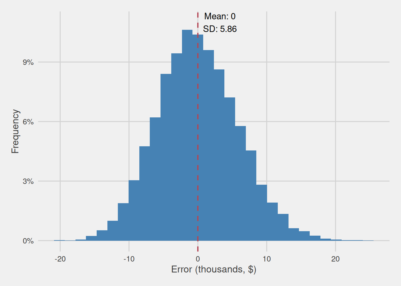
So, rather than focusing on the distribution of various sample means, we are now examining how errors, the differences between sample means and population means, are distributed. Notably, this error is expressed in the same units as our variable, i.e., in thousands of dollars.
Ideally, we aim to obtain errors that remain invariant across different measurement scales, enabling us to compare error distributions across different variables, even when they use distinct units of measurement. Achieving this requires us to utilize a common measurement unit, with the standard deviation commonly being the preferred metric for this purpose.
Consequently, we proceed by dividing each value of our variable by its standard deviation, effectively transforming measurement units into standard deviation units. This process of dividing each observation by the standard deviation is essentially equivalent to dividing the standard deviation by itself, resulting in a standard deviation of 1.
Keep in mind that the standard deviation of the sampling distribution of the mean is identical to the standard error of the mean. Therefore, our process involves dividing the diverse errors by the standard error, resulting in a error measured in standard errors of the mean distribution with a mean of 0 and a standard deviation of 1, as depicted in Figure 8. As we can see, the distribution is still normal, we only shifted its mean to 0 and converted its standard deviation to 1.
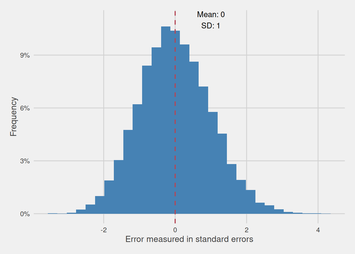
In summary, our process involved subtracting the mean of the sampling distribution of the mean, i.e., the population mean from each computed sample mean, essentially transforming the sample means into errors—difference between the computed mean and the population mean. Following this, we divided these errors by the standard deviation of the sampling distribution of the mean, i.e. the standard error of the mean, thereby representing them in a consistent unit of measurement. The outcome is a distribution with a mean of 0 and a standard deviation of 1, allowing us to compare these standardized errors across various variables effectively. Hence the whole process can be represented through the following formula:
\[ \frac{\bar{x}-\mu}{SE} = \frac{\bar{x}-\mu}{\frac{\sigma}{\sqrt{n}}} \]
This is what we call the standardized version of the sample mean.
Dealing with uncertainty: When standard error information is lacking
Our idealized assumption of knowing the exact standard error of the mean is often impractical in real-world scenarios. As we discussed in the previous post, calculating the standard error usually necessitates either drawing numerous samples of the same size from the same population, calculating the mean for each sample, and then determining the standard deviation of those sample means, or dividing the population’s standard deviation by the square root of our sample size. Unfortunately, both of these methods are frequently unfeasible. To overcome this challenge, we resort to estimating the standard error by dividing the sample’s standard deviation by the square root of the sample size, thereby introducing an additional layer of uncertainty into our calculations.This can be easily visualized by replacing the population’s standard deviation to the sample’s standard deviation in the previous formula:
\[ \frac{\bar{x}-\mu}{\frac{s}{\sqrt{n}}} \]
As previously shown, when we have exact knowledge of the standard error, the distribution of the standardized version of the sample mean follows a normal distribution. However, when we lack precise knowledge of the standard error and instead use an estimate, does the distribution of the standardized version of the sample mean still follow a normal distribution? To verify this, we proceed to visualize the distribution of the standardized version of the sample mean when we don’t know the standard error precisely and estimate it by dividing the sample’s standard deviation by the square root of the sample size. Given that the standard error depends on the sample size, we repeat this process for various sample sizes. For each size, we extract 100,000 samples and compute the standardized version of the sample mean with the estimated standard error. These resulting distributions are illustrated in Figure 9.
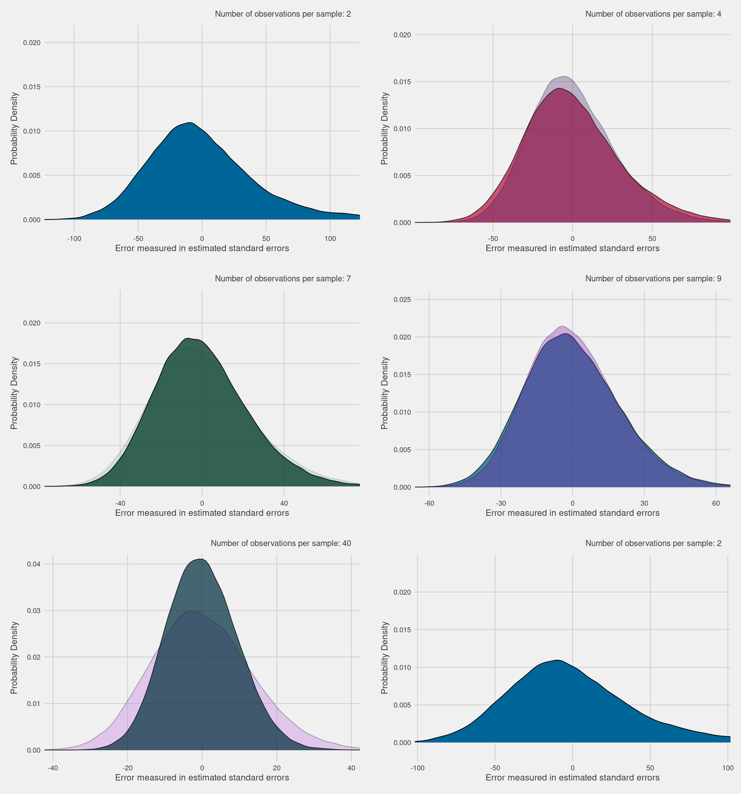
As evident in Figure 9, these errors exhibit a distribution that closely resembles the normal distribution, particularly when dealing with larger sample sizes. However, for smaller sample sizes, the distribution exhibits broader tails compared to the typical normal distribution. In reality, this altered distribution is known as the Student’s t-distribution, commonly referred to as the t-distribution for simplicity.
Embracing the t-distribution
The t-distribution is not a single function but rather a family of functions. Similar to the normal curve, each t-distribution is symmetric, with its mean positioned at the center. However, unlike the normal distribution, in the case of the t-distribution, the mean is always fixed at 0. This means that the t-distribution is centered around 0 by default, and its shape and spread are determined by a parameter known as the degrees of freedom. The concept of degrees of freedom, in a sense, varies from application to application, but in this domain we can understand it as the number of independent pieces of information to calculate a statistic, i.e. the mean for us. For the mean the degrees of freedom are equivalent to the number of observations minus one (\(n-1\)).
The intuition behind the appearance of t-distribution when using the estimated standard error arises from the added uncertainty because of the use of this estimation. It provides a more appropriate and conservative model for the variability of sample means when the standard error is unknown. Unlike the normal distribution, the t-distribution takes sample size into account, presenting wider tails that aptly accommodate the increased uncertainty and variability associated with estimating the standard error from a sample.
Figure 10 illustrates how the t-distribution transforms with varying degrees of freedom. As degrees of freedom increase, the distribution’s tails gradually become narrower, nearing a state that closely resembles the normal distribution. This transformation is a consequence of larger sample sizes, which enable a more refined depiction of the underlying population. Consequently, it leads to reduced sampling errors and, consequently, enhances the precision of our estimations of the standard error, reducing uncertainty.
The t-distribution, in contrast to the normal distribution, exhibits broader tails, making it unsuitable for applying the 68-95-99.7 rule we discussed earlier. With these wider tails, our expectations change: we can no longer anticipate approximately 68% of potential mean values falling within 1 standard error of the mean, 95% within 2, and 99.7% within 3; these proportions are now reduced.
As the characteristics of the t-distribution are contingent upon degrees of freedom, we must consider them when determining the number of standard errors from the mean required to encompass a specific proportion of values. These precise proportions will vary as degrees of freedom change. Nevertheless, as degrees of freedom increase, the distribution of standardized sample means approximates a normal distribution, allowing us to eventually employ the 68-95-99.7 rule.
Table 1 provides the critical values for t-distributions across a range of degrees of freedom and confidence levels. Notably, as the sample size becomes sufficiently large, the critical values for the t-distribution closely mirror those of a (standardized) normal distribution. In fact, when dealing with an infinite number of degrees of freedom, the critical values for the t-distribution converge to those of a normal distribution. Consequently, for sufficiently large sample sizes, it’s entirely justified to work directly with a normal distribution due to its close approximation to the t-distribution in such cases.
Display Table 1
| Degrees of Freedom (df) | 68% Critical Value | 95% Critical Value | 99.7% Critical Value |
|---|---|---|---|
| 1 | 1.819 | 12.706 | 212.205 |
| 2 | 1.312 | 4.303 | 18.216 |
| 3 | 1.189 | 3.182 | 8.891 |
| 4 | 1.134 | 2.776 | 6.435 |
| 5 | 1.104 | 2.571 | 5.376 |
| 6 | 1.084 | 2.447 | 4.800 |
| 7 | 1.070 | 2.365 | 4.442 |
| 8 | 1.060 | 2.306 | 4.199 |
| 9 | 1.053 | 2.262 | 4.024 |
| 10 | 1.046 | 2.228 | 3.892 |
| 20 | 1.020 | 2.086 | 3.376 |
| 30 | 1.011 | 2.042 | 3.230 |
| 40 | 1.007 | 2.021 | 3.160 |
| 50 | 1.004 | 2.009 | 3.120 |
| 60 | 1.003 | 2.000 | 3.094 |
| 70 | 1.002 | 1.994 | 3.075 |
| 80 | 1.001 | 1.990 | 3.061 |
| 90 | 1.000 | 1.987 | 3.051 |
| 100 | 0.999 | 1.984 | 3.042 |
| 150 | 0.998 | 1.976 | 3.017 |
| Infinity | 0.994 | 1.960 | 2.968 |
Estimating confidence intervals for our exemplary sample of 40 Customers
Having established that estimating, rather than precisely knowing the standard error, introduces an additional layer of uncertainty, we must adapt our approach when calculating margins of error and confidence intervals. Instead of relying on the normal distribution, we turn to the t-distribution, a distribution whose shape varies with the sample size. For smaller samples, it features wider tails, transitioning towards a normal distribution as the sample size increases. These wider tails account for the added uncertainty, resulting in more conservative estimates.
Returning to our example, where we examined a sample of 40 customers with a mean of $134,320 the first step is to estimate the standard deviation for this sample, which amounts to $70,439. Therefore, we estimate the standard error by dividing this standard deviation by the square root of 40, resulting in an estimated standard error of $11,137.38.
For a desired confidence level of 99.7%, we should use a critical value of 3.166. This value corresponds to the critical value for a confidence level of 99.7% and 39 degrees of freedom (40-1). Moreover, note that this critical value is larger than the value of 3, which we used when we knew the standard error and, thus, had a sampling distribution of the mean that followed a normal distribution. Consequently, we can calculate the margin of error by multiplying the critical value for the chosen confidence level by the estimated standard error, yielding a margin of error of $35,260.95 (\(3.166 \times \$11,137.38\) = \(\$35,260.95\)). With 99.7% confidence, the population mean is estimated to fall between (\(\$134,320\pm\$35,260.95\)) $99,059.05 and $169,581.
These confidence intervals, which are wider than the previous ones obtained when we knew the exact standard error, provide a range of $99,059.05 to $169,581, as opposed to the narrower intervals of $116,734 to $151,906. This increase in width reflects the additional caution necessitated by the t-distribution’s wider tails and the inherent uncertainty associated with estimating the standard error.
95% confidence as a standard
In the examples provided thus far, we’ve been working with a relatively high confidence level of 99.7%. While such a level of confidence is valuable in certain contexts, it’s worth highlighting that in everyday practical applications, a 95% confidence level is the more prevalent choice.
A 95% confidence level offers a balanced compromise between precision and practicality. This means that we are willing to tolerate a 5% chance of not capturing the population mean within the defined intervals, in return for the benefits of having narrower confidence intervals.
A final note
In the preceding sections, we saw that we can define confidence intervals by leveraging the shape of the sampling distribution. This sampling distribution can be converted into an error distribution measured in standard errors (or estimated standard errors). And from such distribution, we can find critical values that define the points within which the majority of errors will be found, in a way that we can calculate confidence intervals. Thus, given that such a distribution for other statistics follows a symmetrical as previously seen, we can extract some simple formula for the computation of the confidence interval of such statistics.
A confidence interval consists of two limits, defining the lower and upper bounds of the interval, where the point estimate lies at the center. The confidence interval (CI) for an estimator of a parameter \(\theta\) can be expressed in the following way:
\[CI_{\theta} = \hat{\theta}\pm MOE\]
meaning that the upper confidence interval for a parameter \(\theta\) is equal to the estimator for that parameter (\(\hat{\theta}\)), i.e., the value obtained in the sample for that parameter, plus the margin of error (MOE). While the lower confidence interval is equal to the estimator for that parameter (\(\hat{\theta}\)) minus the margin of error.
The margin of error corresponds to half the width of the interval and is given by:
\[MOE = \Phi^{-1}_{1-\frac{\alpha}{2}} \times \hat{\sigma}_{\theta} \]
Here, \(\hat{\sigma}_{\theta}\) represents the estimated standard error of \(\theta\) and \(\Phi^{-1}_{1-\frac{\alpha}{2}}\) denotes the critical value. More specifically it refers to the inverse quantile function, which includes a confidence level equal to \(1-\alpha\), i.e., a function that tells us the point in which that proportion of the distribution is found.
While the exact sampling distribution for some statistics can be unknown, as well as their standard error, the central limit theorem often provides a justification for using a normal approximation. For this reason, for most statistics, we tend to assume that their sampling distribution follows a normal distribution (given that the sample is large enough. An example is the t-distribution which for large enough samples approximates the normal distribution). This approximation tends to be accurate, but even in cases in which it’s not that accurate, it’s better to have an approximate confidence interval than a solely-point estimate.
Summary
Sampling error arises from using samples rather than the entire population for analysis, as samples may not capture all population nuances.
The sampling error can be quantified using the standard error, which measures the variability of a statistic calculated from different samples.
The standard error helps define a range within which sample statistics are likely to fall, providing insights into potential population parameters.
The sampling distribution of the mean follows a normal distribution, with its mean equal to the population mean and standard deviation equal to the standard error.
The 68-95-99.7 rule provides a shorthand for understanding the distribution: approximately 68% of values are within 1 standard deviation from the mean, 95% within two standard deviations, and 99.7% within three standard deviations. These values defining specific regions are known as critical values.
Translating this to standard errors, 68% of values are about 1 standard error from the population mean, 95% about two standard errors, and 99.7% about three standard errors.
A sample, with 95% confidence, is expected to be about 2 standard errors from the mean, and with 99.7% confidence, about 3 standard errors.
This argument can be reversed: with 95% confidence, a sample is about 2 standard errors from the population mean, and with 99.7% confidence, about 3 standard errors.
The margin of error, which creates a likely population range (confidence interval), is determined by multiplying the critical value by the standard error.
The confidence interval is obtained by adding the margin of error to the sample mean (upper interval) and subtracting it from the sample mean (lower interval).
In most cases, the standard error is unknown and needs to be estimated by dividing the sample’s standard deviation by the square root of its size.
When estimating the standard error, the assumption that the sampling distribution of the mean follows a normal distribution no longer holds; it follows a Student t-distribution.
The Student t-distribution (t-distribution) varies based on degrees of freedom, resembling the normal distribution but having wider tails with smaller sample sizes (degrees of freedom).
The wider tails of the t-distribution result in larger magnitude critical values than the normal distribution, leading to wider confidence intervals.
Click to reveal the R code used to generate the various plots in this post.
# Customer annual income distribution (thousands, $) ---------------

library(tidyverse)
library(ggthemes)

#Read customer data
customer_data <- read.csv("assets/customer.csv")
customer_data$Income <- customer_data$Income/1000
#Compute the average and standard deviation of the income
average_income <- mean(customer_data$Income)
std_deviation_income <- sd(customer_data$Income)

ggplot(customer_data, aes(x = Income)) +
  geom_histogram(aes(y = after_stat(count / sum(count)*100)), fill = "steelblue") +
  labs(
    x = "Annual Income (thousands, $)",
    y = "Frequency"
  ) +
  theme_fivethirtyeight() +
  theme(plot.title = element_text(hjust = 0),
    axis.title.x = element_text(hjust = 0.5),
    axis.title.y = element_text(hjust = 0.5),
    plot.caption = element_text(hjust = 0)) +
    scale_y_continuous(labels = scales::percent_format(scale = 1)) +
    scale_x_continuous(breaks = round(seq(30, 320, by = 20))) +
   annotate("text", x = max(customer_data$Income, na.rm = TRUE) * 0.95, y = 12, label = paste0("Mean: ", round(average_income, 2), "\nSD: ", round(std_deviation_income, 2)))

# Create exemplary normality plot ---------------

# Define a fine grid for x (covering roughly ±4 standard deviations)
x <- seq(-4, 4, length.out = 1000)
# Compute the theoretical normal density (standard normal)
y <- dnorm(x)

# Create a data frame for plotting
theoretical_density <- data.frame(values = x, density = y)

ggplot(theoretical_density, aes(x = values, y = density)) +
  geom_area(fill = "steelblue", alpha = 0.4) +
  geom_line(color = "steelblue", size = 1) +
  labs(y = "Frequency") +
  theme_fivethirtyeight() +
  theme(plot.title = element_text(hjust = 0),
        axis.title.x = element_blank(),
        axis.text.x = element_blank(),
        axis.ticks.x = element_blank(),
        axis.text.y = element_blank(),
        axis.ticks.y = element_blank(),
        plot.caption = element_text(hjust = 0)) +
  scale_y_continuous(labels = scales::percent_format(scale = 1))

# Visual representation of the 68-95-99.7 rule ---------------

mu = 0
sigma = 1
x <- seq(-5*sigma, 5*sigma, length.out = 1000)
y <- dnorm(x, mean = mu, sd = sigma)
data <- data.frame(x, y)

ggplot(data.frame(data), aes(x)) +
    geom_ribbon(data = subset(data, x >= mu - 3 * sigma & x <= mu + 3 * sigma),
                aes(ymax = y), ymin = 0, fill = "#c1f5ef") +
    geom_ribbon(data = subset(data, x >= mu - 2 * sigma & x <= mu + 2 * sigma),
                aes(ymax = y), ymin = 0, fill = "#90ebe1") +
    geom_ribbon(data = subset(data, x >= mu - 1 * sigma & x <= mu + 1 * sigma),
                aes(ymax = y), ymin = 0, fill = "#34d1bf") +
  geom_ribbon(data = subset(data, x >= -0.01 & x <= 0.01),
                aes(ymax = y), ymin = 0, fill = "black") +
    theme_minimal() +
    geom_vline(xintercept = c(mu - 3 * sigma, mu - 2 * sigma, mu - 1 * sigma, mu + 1 * sigma, mu + 2 * sigma, mu + 3 * sigma),
               linetype = "dashed", color = "black", alpha = 0.5) +
    geom_segment(x = 0 - 1 * sigma +0.05, xend = 0 + 1 * sigma -0.05, y = 0.45, yend = 0.45, alpha = 0.4, arrow = arrow(length = unit(0.015, "npc"), ends = "both")) +
  annotate("text", x = 0, y = 0.46, label = "68%") +
  geom_segment(x = 0 - 2 * sigma +0.05, xend = 0 + 2 * sigma -0.05, y = 0.5, yend = 0.5, alpha = 0.4, arrow = arrow(length = unit(0.015, "npc"), ends = "both")) +
   annotate("text", x = 0, y = 0.51, label = "95%") +
  geom_segment(x = 0 - 3 * sigma +0.05, xend = 0 + 3 * sigma -0.05, y = 0.55, yend = 0.55, alpha = 0.4, arrow = arrow(length = unit(0.015, "npc"), ends = "both")) +
   annotate("text", x = 0, y = 0.56, label = "99.7%") +
  ylim(c(0, 0.6)) +
  scale_x_continuous(breaks=c(-3, -2, -1, 0, 1, 2, 3), labels = c(expression(mu ~ "- 3" ~ sigma), expression(mu ~ "- 2" ~ sigma), expression(mu ~ "-" ~ sigma), expression(mu), expression(mu ~ "+" ~ sigma), expression(mu ~ "+ 2" ~ sigma),  expression(mu ~ "+ 3" ~ sigma))) +
  theme_fivethirtyeight() +
  theme(plot.title = element_text(hjust = 0),
        axis.title.x=element_blank(),
        axis.title.y=element_blank(),
        axis.text.y=element_blank(),
        axis.ticks.y=element_blank(),
        panel.grid.major = element_blank(),
        panel.grid.minor = element_blank(),
        plot.caption = element_text(hjust = 0))

# Average income distribution of 10,000 samples of 40 customers (thousands, $) ---------------

set.seed(0)
# Create an empty numeric vector of length 10000 named 'sample40_means'
sample40_means <- numeric(length = 10000)

# Generate a for loop iterating 10000 times
# For each iteration, the variable 'i' takes the value of the current iteration
for (i in 1:10000) {
  # Generate a sample of 40 observations from the Income variable
  sample_population <- sample(customer_data$Income, 40)
  # Calculate the mean of the sample and store it in the 'i' position of the 'sample_means' vector
  sample40_means[i] <- mean(sample_population)
}

average_income <- round(mean(sample40_means), 2)
sample_means <- data.frame(Income = sample40_means)


ggplot(sample_means, aes(x = Income)) +
  geom_histogram(aes(y = after_stat(count / sum(count)*100)), fill = "steelblue") +
  geom_vline(xintercept = average_income, color = "#B44655", linetype = "dashed", size = 0.75) +
  labs(
    x = "Annual Income (thousands, $)",
    y = "Frequency"
  ) +
  theme_fivethirtyeight() +
  theme(plot.title = element_text(hjust = 0),
    axis.title.x = element_text(hjust = 0.5),
    axis.title.y = element_text(hjust = 0.5),
    plot.caption = element_text(hjust = 0)) +
    scale_y_continuous(labels = scales::percent_format(scale = 1)) +
   annotate("text", x = average_income * 1.05, y = 10, label = paste0("Mean: ", round(average_income, 2)))

# Exemplary possible sample means distributions ---------------

library(gganimate)

sample_mean <- 134.320
standard_error <- sd(sample40_means)

# Define a set of possible means.
possible_mean_sample <- seq(sample_mean - 3 * standard_error,
                            sample_mean + 3 * standard_error, length.out = 7)
# Overwrite one value as in the original.
possible_mean_sample[2] <- 120.950

# Define a common x-axis range that covers all curves.
x_min <- min(possible_mean_sample) - 3 * standard_error
x_max <- max(possible_mean_sample) + 3 * standard_error
x_seq <- seq(x_min, x_max, length.out = 200)

# Build a data frame of theoretical density curves for each possible mean.
density_data <- data.frame()
for (m in possible_mean_sample) {
  d <- dnorm(x_seq, mean = m, sd = standard_error)
  tmp <- data.frame(Income = x_seq, Density = d,
                    possible_mean_sample = round(m, 2))
  tmp$title <- paste0("Assuming samples extracted from a population \nwith M = ",
                      round(m,2), " (SEM = ", round(standard_error,2), ")")
  density_data <- rbind(density_data, tmp)
}

# Data frame for the vertical dashed lines showing each possible mean.
possible_means_df <- data.frame(Mean_value = possible_mean_sample,
                                title = unique(density_data$title))

# Create the plot.
p <- ggplot(density_data, aes(x = Income, y = Density)) +
  annotate("rect",
           xmin = sample_mean - 3 * standard_error,
           xmax = sample_mean + 3 * standard_error,
           ymin = 0, ymax = 0.075, alpha = 0.1) +
  annotate("text",
           x = sample_mean - 3 * standard_error * 1.05,
           y = 0.025, label = "Sample Mean - 3SE",
           alpha = 0.3, angle = 90) +
  annotate("text",
           x = sample_mean + 3 * standard_error * 1.05,
           y = 0.025, label = "Sample Mean + 3SE",
           alpha = 0.3, angle = -90) +
  annotate("text",
           x = sample_mean, y = 0.077, label = "Sample Mean",
           alpha = 0.3) +
  geom_vline(xintercept = sample_mean, size = 0.4, alpha = 0.4,
             linetype = "dashed") +
  geom_area(fill = "steelblue", alpha = 0.4) +
  geom_line(color = "steelblue") +
  geom_vline(data = possible_means_df,
             aes(xintercept = Mean_value),
             color = "#B44655", linetype = "dashed", size = 0.75) +
  geom_text(data = possible_means_df,
            aes(x = Mean_value * 1.08, y = 0.05,
                label = paste0("Mean: ", round(Mean_value, 2)))) +
  labs(
    x = "Annual Income (thousands, $)",
    y = "Probability Density"
  ) +
  theme_fivethirtyeight() +
  theme(plot.title = element_text(hjust = 0, size = 12),
        axis.title.x = element_text(hjust = 0.5),
        axis.title.y = element_text(hjust = 0.5),
        plot.caption = element_text(hjust = 0)) +
  transition_states(title, transition_length = 1.25, state_length = 2) +
  enter_fade() +
  exit_fade()

p <- p + labs(title = "{closest_state}")

# Render the animation.
anim <- animate(p, nframes = 180, duration = 20)
anim

# Error Distribution of the Means for 10,000 Samples of 40 Customers (thousands, $) ---------------

sample_means_error <- sample_means
sample_means_error$error <- sample_means$Income - mean(sample_means$Income)

sd_sample_means_error <- sd(sample_means_error$error)


ggplot(sample_means_error, aes(x = error)) +
  geom_histogram(aes(y = after_stat(count / sum(count)*100)), fill = "steelblue") +
  geom_vline(xintercept = 0, color = "#B44655", linetype = "dashed", size = 0.75) +
  labs(
    x = "Error (thousands, $)",
    y = "Frequency"
  ) +
  theme_fivethirtyeight() +
  theme(plot.title = element_text(hjust = 0),
    axis.title.x = element_text(hjust = 0.5),
    axis.title.y = element_text(hjust = 0.5),
    plot.caption = element_text(hjust = 0)) +
    scale_y_continuous(labels = scales::percent_format(scale = 1)) +
   annotate("text", x = 3.2, y = 11, label = paste0("Mean: 0\nSD: ", round(sd_sample_means_error, 2)))

# Sampling error of the mean measured in standard errors distribution for 10,000 Samples of 40 Customers ---------------

sample_means_error$error_div_sd <- sample_means_error$error / sd(sample_means$Income)

sd_sample_means_error <- sd(sample_means_error$error_div_sd)


ggplot(sample_means_error, aes(x = error_div_sd)) +
  geom_histogram(aes(y = after_stat(count / sum(count)*100)), fill = "steelblue") +
  geom_vline(xintercept = 0, color = "#B44655", linetype = "dashed", size = 0.75) +
  labs(
    x = "Error measured in standard errors",
    y = "Frequency"
  ) +
  theme_fivethirtyeight() +
  theme(plot.title = element_text(hjust = 0),
    axis.title.x = element_text(hjust = 0.5),
    axis.title.y = element_text(hjust = 0.5),
    plot.caption = element_text(hjust = 0)) +
    scale_y_continuous(labels = scales::percent_format(scale = 1)) +
   annotate("text", x = 1, y = 11, label = paste0("Mean: 0\nSD: ", round(sd_sample_means_error, 2)))

# Sampling error of the mean measured in estimated standard errors distribution for 100,000 Samples of varying number of Customers ---------------

set.seed(34)
sample_sizes <- c(seq(2, 10, by = 1), seq(20, 60, by = 20))
samples_different_sizes <- data.frame(values = NA, sizes = NA, sd = NA)
for(sample_size in sample_sizes){

  sample_means_diff_size <- numeric(length = 100000)

  for(i in seq(1, 100000)){
     sample_means_diff_size[i] <- mean(sample(customer_data$Income, sample_size))

  }
  samples_different_sizes2 <- data.frame(values = sample_means_diff_size, sizes = sample_size, sd = sd(sample_means_diff_size))
  samples_different_sizes <- rbind(samples_different_sizes, samples_different_sizes2)

}

samples_different_sizes <- samples_different_sizes[-1,]


samples_different_sizes$error_divided_by_sd <- (samples_different_sizes$values - mean(customer_data$Income)) /(samples_different_sizes2$sd/sqrt(samples_different_sizes2$sizes))


samples_different_sizes$sizes <- as.factor(samples_different_sizes$sizes)
levels(samples_different_sizes$sizes) <- paste("Number of observations per sample:", levels(samples_different_sizes$sizes))
data_error_div_sd_average <- samples_different_sizes %>%
  summarise(mean_error_div_sd = mean(error_divided_by_sd), .by = sizes)

p <- ggplot(samples_different_sizes, aes(x = error_divided_by_sd, fill = sizes)) +
  geom_density() +
  labs(
    x = "Error measured in estimated standard errors",
    y = "Probability Density"
  ) +
  theme_fivethirtyeight() +
  scale_fill_manual(values = c(
  "#006699", "#FF9E00", "#B5113E", "#3B125F", "#007F7B", "#1A4C3C",
  "#7C0A02", "#00567F", "#7500A4", "#B760DE", "#002E3E", "#7F7F7F"
)) +
  theme(plot.title = element_text(hjust = 0.95, size = 11),
    axis.title.x = element_text(hjust = 0.5),
    axis.title.y = element_text(hjust = 0.5),
    plot.caption = element_text(hjust = 0), legend.position="none") +
  transition_states(sizes) +
  enter_fade() +
  view_zoom_manual(xmin = c(-120, -100,  -90,  -75,  -70,  -70,  -60, -60, -60,  -45,  -30,  -30), xmax = -1 * c(-120, -100,  -90,  -75,  -70,  -70,  -60, -60, -60,  -45,  -30,  -30), ymin = rep(0, 12), ymax = c(rep(0.02, 5), rep(0.025, 3), 0.03,  0.035, 0.05, 0.06)) +
  exit_fade()

p <- p + labs(title = "{closest_state}")

# Render the animation
anim <- animate(p, nframes = 180, duration = 25)
anim